3. Reflections
Mirror, mirror, on the wall, what's the hottest trend of all? It might just be reflections. With Apple leading the way, looking like all their graphics were set on a shiny table, others are sure to follow. Dubbed by some as ?the new drop shadow,? reflections are taking over, especially on the web. The reflections might be skewed, such as in the Logo for blinklist, indicating the location of some light source, invisible to the onlooker, but effective in creating even more of a sense of a whole different world the Logo is in.

3. 反射效果(镜像效果)
魔镜魔镜告诉我,什么是最热的潮流啊? 它可能就是“反射效果”。苹果最先开始倡导的,把什么东西都弄得好像放在光滑闪亮的桌面上,其他人就开始跟风。有人给它起了个绰号叫什么来着?“新的下拉阴影”(意思和以前的“下拉阴影”效果一样满天飞)。 “反射效果”全面霸占,尤其是在网上。反射效果可以是不对称的,就像 blinklist 的Logo一样,弄出一些光的效果却让你找不到光源,但对于创造拥有更多“完全不同的世界”感觉的Logo是有效而时尚的。
4. Rectangle
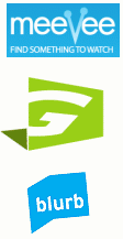
In a graphic world where you can do nearly anything, some companies are keeping it simple with shaded rectangles. Their Logo, in a contrasting white, pops out from the background. Shadow boxes have historically been a sign of amateurish design, but this new generation of effective Logos has shown that good design will always be in style. With the popularity of rounded corners, these Logos stand out with (oh no!) sharp edges and right angles. In some occasions, such as with the blurb Logo, the rectangle can represent an image. Blurb used their blue shadow behind their name to symbolize a book, as they are in the book publishing business.
4. 长方形
在图形世界里,你几乎可以做任何事情,但有些公司只使用简单的带边框的长方形。他们的Logo,从高反差的白色背景上“跳”出来。相框一样的长方形容易给人“业余设计水平”的感觉,但是新生的有活力的这些Logo,表明了好的设计永远都是有品味的。与人气极旺的圆角风格同时,这些Logo因有着锐利的边缘和适当的倾斜角度而特别显眼(不是吧!)。在某些场合,就像 Blurb的Logo,长方形可以用于扮演一个形象。Blurb 用蓝色的图形放在名字后面来代表一本书,因为他们做的是图书出版业务。
5. 3d Puffies
With these new puffed-up Logos, you don't know whether to click on them or bounce on them. Now that the industry has overcome the production issues of gradients, designers seem to prefer air-popped graphics to the flat drawings of yore. Even desktop icons these days seem to have a rounded feel, like you might pop one with one good hard double-click. It's a 2D world out there in Internet land, and these 3D images really make Web pages and Logos jump out of the page, to where you feel you could run your hands over the computer screen and feel their bumps and curves.